
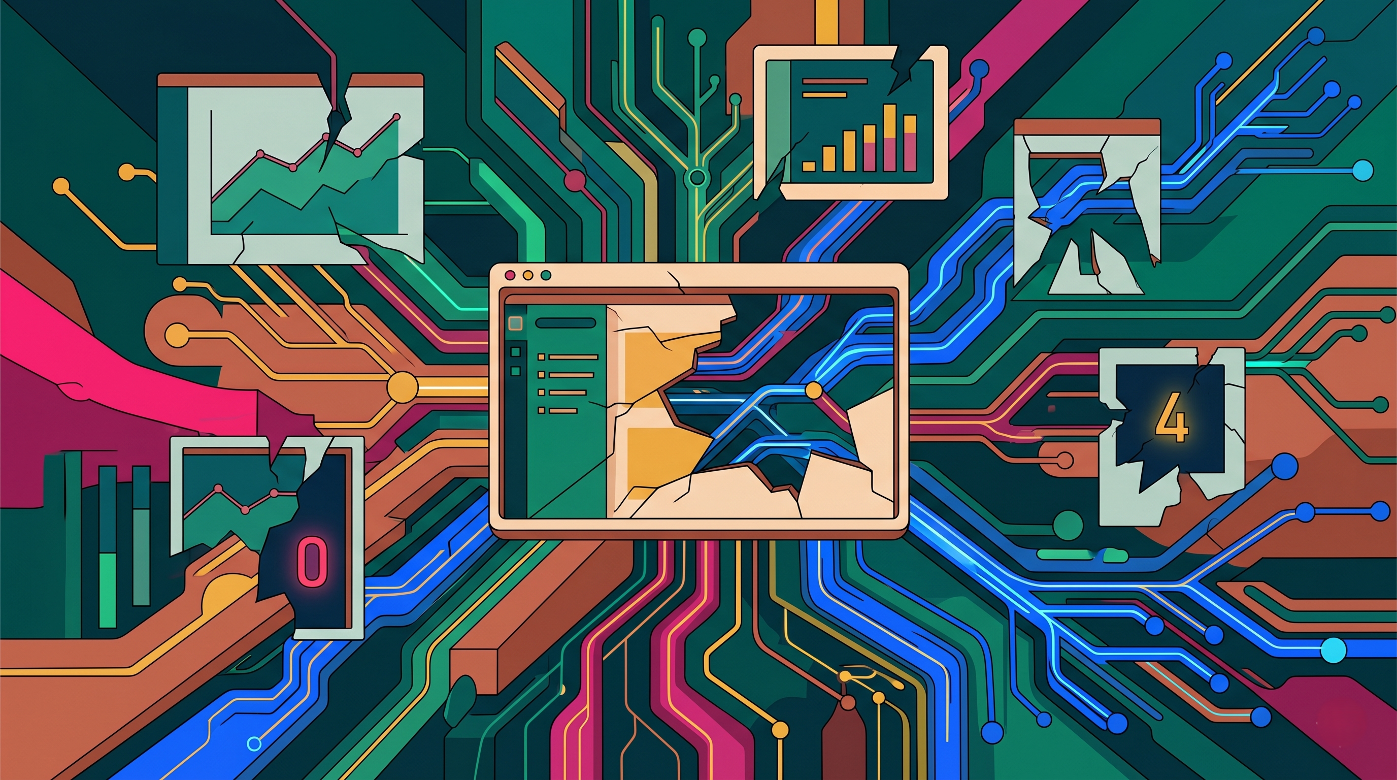
Dashboards have become the default interface for modern operations.
Engineering teams rely on them to monitor application performance, track infrastructure health, observe Kubernetes clusters, analyze cloud spending, monitor AI workloads, and measure business metrics. From executive reporting to incident response, dashboards are often the first place people look when trying to understand what is happening inside a system.
The assumption is simple: if the dashboard is showing the right metrics, teams have visibility into their environment.
But there is a problem.
No matter how sophisticated a dashboard becomes, it only presents a limited view of reality. It shows selected metrics, predefined visualizations, and data points that someone decided were important enough to track. What it cannot fully capture is the context, relationships, dependencies, and operational dynamics that influence how systems actually behave.
As cloud-native environments become increasingly complex, organizations are discovering that having more dashboards does not necessarily lead to greater understanding. In many cases, teams are surrounded by information yet still struggle to answer fundamental questions about reliability, performance, infrastructure efficiency, and operational risk.
The issue is not that dashboards are ineffective. The issue is that every dashboard tells only part of the story.
Let's get right into the blog and explore why dashboards have limitations, where visibility gaps emerge, and what organizations need beyond traditional monitoring views.
Dashboards Show Metrics, Not Meaning
A dashboard is designed to display information. It can show CPU utilization, memory consumption, latency trends, error rates, cloud spending, or application traffic with remarkable accuracy.
However, displaying a metric is not the same as explaining its significance.
A spike in resource utilization may represent healthy business growth, a temporary workload shift, an inefficient deployment, or an emerging reliability problem. The dashboard can show the spike, but it cannot automatically explain why it occurred or what actions should follow.
This creates a common operational challenge where teams spend less time collecting data and more time interpreting it.
The metric provides visibility. Understanding requires context.
Systems Behave Through Relationships, Not Individual Metrics
Modern cloud-native environments are built on interconnected systems.
Applications depend on APIs, databases, Kubernetes workloads, networking layers, observability platforms, AI services, and shared infrastructure. A change in one area often influences multiple others.
Most dashboards, however, focus on individual metrics or isolated components.
A Kubernetes dashboard may show node health. An application dashboard may display latency. A cloud dashboard may report infrastructure spending. Each view is useful, but none captures how those elements influence one another.
As a result, teams often understand individual symptoms while struggling to understand the relationships creating those symptoms.
The most important operational insights frequently exist between dashboards rather than inside them.
Dashboards Reflect What Teams Expect to See
Every dashboard is designed intentionally.
Teams choose which metrics to collect, which visualizations to create, and which thresholds to monitor. These decisions are usually based on known requirements, historical experiences, and expected operational scenarios.
The challenge is that infrastructure rarely limits itself to expected behavior.
Unexpected interactions, emerging dependencies, workload anomalies, and evolving architectural patterns often create issues that were never anticipated when dashboards were originally designed.
This means dashboards naturally focus on known questions while operational reality continues generating new ones.
Organizations may have excellent visibility into the problems they expected to encounter while remaining blind to the problems they never considered.
Kubernetes Environments Change Faster Than Dashboards
Kubernetes introduces a level of operational dynamism that traditional dashboards often struggle to capture effectively.
Workloads scale automatically, containers move between nodes, resource allocation changes continuously, deployments occur frequently, and infrastructure conditions evolve throughout the day.
A dashboard provides a snapshot of this environment at a specific moment. The challenge is that Kubernetes behavior is driven by patterns and relationships that unfold over time.
A cluster may appear healthy according to current metrics while simultaneously exhibiting resource fragmentation, inefficient scaling behavior, or hidden dependency risks.
Understanding these dynamics requires more than observing current conditions. It requires visibility into how those conditions are changing and why.
AI Workloads Create New Visibility Challenges
The rapid growth of AI infrastructure is exposing additional limitations in traditional dashboards.
AI environments involve GPU utilization, inference latency, vector databases, model-serving platforms, retrieval systems, and complex workload dependencies. These systems generate large amounts of telemetry but often behave differently from traditional applications.
A dashboard may show GPU usage percentages or model response times, but those metrics alone rarely explain infrastructure efficiency, resource allocation quality, or future capacity requirements.
As organizations scale AI initiatives, they increasingly need visibility into operational behavior rather than simply operational statistics.
The difference between seeing AI infrastructure and understanding AI infrastructure is becoming increasingly important.
Incident Investigations Rarely Stay Inside a Single Dashboard
One of the clearest examples of dashboard limitations appears during incident response.
When a production issue occurs, engineers rarely solve it by looking at a single dashboard. Instead, they move across multiple monitoring systems, logs, traces, deployment histories, infrastructure views, and operational tools.
This happens because incidents are usually shaped by interactions between systems rather than isolated failures.
A dashboard may identify where symptoms appear, but root causes often exist elsewhere within the broader environment.
The need to switch constantly between tools highlights a fundamental reality: no individual dashboard contains the complete operational story.
Understanding emerges when information from multiple sources is connected into a coherent view.
Cloud Costs Cannot Be Understood Through Billing Data Alone
Cloud cost dashboards provide valuable financial visibility, but they often struggle to explain why spending changes.
Organizations may see rising infrastructure costs without understanding which workloads, architectural decisions, autoscaling behaviors, or operational patterns are responsible.
Billing data reveals outcomes. It rarely reveals causes.
For example, increasing cloud spending may be linked to oversized Kubernetes resource requests, observability growth, AI workload expansion, inefficient scaling policies, or architectural complexity.
Without operational context, teams can identify cost increases but struggle to address the behaviors creating them.
This is why cloud optimization increasingly depends on infrastructure visibility rather than financial reporting alone.
Operational Context is Often Missing
The biggest limitation of dashboards is not missing data. It is missing context.
Context explains:
Why a metric changed
What systems are affected
Which dependencies are involved
Whether the issue is growing or shrinking
What actions should be prioritized
Without context, teams are left interpreting isolated signals.
The dashboard may reveal that something is happening, but it often cannot explain whether the event is significant, how it relates to other conditions, or what consequences may follow.
As environments become more distributed, context becomes one of the most valuable forms of operational intelligence.
Visibility Must Evolve Beyond Static Views
Dashboards will continue to play an important role in cloud-native operations. They remain valuable tools for monitoring, reporting, and operational awareness.
However, modern environments require more than static visualizations.
Organizations increasingly need visibility into workload behavior, infrastructure relationships, dependency networks, resource utilization patterns, architectural evolution, and operational trends that extend beyond predefined charts and graphs.
The goal is no longer simply seeing data. The goal is understanding systems.
This shift represents a broader evolution from monitoring infrastructure to understanding infrastructure.
Building Deeper Operational Understanding with Atler Pilot
As cloud-native environments become more complex, engineering teams need visibility that extends beyond traditional dashboards. Understanding workload behavior, Kubernetes utilization, infrastructure dependencies, AI resource consumption, and operational relationships requires a more comprehensive view of how systems actually operate.
Atler Pilot helps organizations move beyond isolated metrics by connecting infrastructure telemetry, workload intelligence, utilization insights, and operational context into a unified view of cloud-native environments. This enables teams to understand not only what is happening across their infrastructure but also why it is happening and how different systems influence one another.
By improving visibility into operational behavior, Atler Pilot helps engineering, platform, and FinOps teams make more informed decisions, reduce complexity, optimize resources, and strengthen infrastructure reliability.
Dashboards help teams see data. Operational intelligence helps teams understand systems.
Sign up for Atler Pilot and discover how deeper infrastructure visibility can help your teams move beyond metrics and gain meaningful operational insight.
Conclusion
Dashboards are valuable, but they are not complete representations of reality.
Every dashboard highlights certain metrics, focuses on specific systems, and answers predefined questions. What it cannot fully capture are the relationships, dependencies, behaviors, and contextual factors that influence how modern cloud-native environments operate.
As Kubernetes ecosystems, AI workloads, distributed applications, and multi-cloud architectures continue growing in complexity, organizations need visibility that goes beyond charts and graphs.
Because the most important operational insights are often not the ones displayed on the dashboard. They are the ones hidden in the connections between the data.
All in One Place
Atler Pilot decodes your cloud spend story by bringing monitoring, automation, and intelligent insights together for faster and better cloud operations.